Revamped data tables in new UI
Our goal is always to try to further enhance the user experience of PlanMill and after receiving valuable feedback from the users we looked into the bottlenecks of data table usability and ended up making major changes in this area.
We feel that the new layout is a big improvement over the old one by allowing easy access to all the relevant features while still maintaining the clean look-and-feel.
Here we have listed the key features.
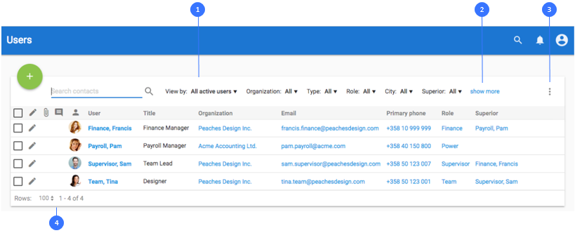
- Filters are now located at the top of the data table for easy access.
- By default only your favorite filters are shown. You can show all the available filters by clicking “Show more”.
- All the less used actions have been moved behind the More action.
-
Paging information and tools are now located at the bottom-left part of the data table.
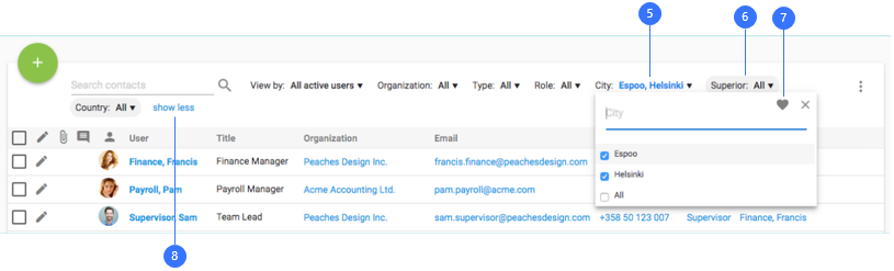
- Selected filter values are highlighted with a blue color.
- Non-favorited filters have a gray background. If such a filter has a selected value all the filters are shown when navigated on to a page.
- Use the heart icon to Mark/Unmark a filter as favorite.
-
Show less -link will hide the non-favorite filters
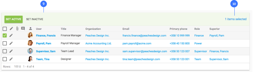
- Display a contextual header that activates when items are selected.
- The top bar now also shows how many rows are currently selected.


