All-new PlanMill UI
General
The new PlanMill UI has an improved overall usability and is now completely responsive to enable use on smaller devices like smart phones and tablets. The new UI is based on the Google Material Design guidelines which makes the UI coherent in content and style.
TRY NOW: Try the new PlanMill UI by navigating to My page and changing the User Interface from Classic to New.
Top bar & main navigation
New top bar consists of
- Menu icon

- Expandable search

- Timer icon

- Notifications icon

- Icon for My page access

Main navigation
- Situated on the left and has transformed from horizontal to vertical.
- By toggling the menu icon you can hide and show the Main navigation.
- Modules are regrouped into a more logical order to enable easier navigation.

Form
- New navigation panel allowing navigation through quick links is situated on the right side of the view.
- Fill the form using single-line and multi-line fields, auto-complete text fields as well as dropdown lists.
- Required fields are marked with an asterisk(*).

Summary page
- Likewise in Forms, new panel with category quick links is situated on the right.
- Possible to see the main structure of the summary page at a glance, which is especially helpful in the case of many categories.

Data tables (list view)
- New location for filters
- Tools in one place

Read more about forms, summaries and data tables (list views).
My workspace
- As the front page for PlanMIll, My workspace has a new card based look for My performance indicators, My reports and My links.
- A new feature for indicator cards is the possibility to toggle between the key value and the corresponding chart.
- You can personalize My workspace to include only the information you need.


Reports and indicators
Reports and indicators follow the same card based look as My workspace. The new favourite icon brings information to My workspace.

Notifications
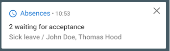
Notifications is a completely new feature which provides better monitoring and informs the user about different events.
Read more about Notifications.
Timer
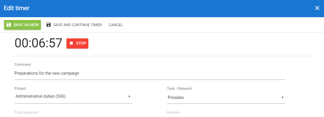
Read more about Timer.
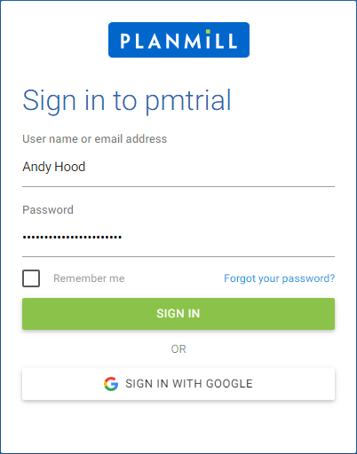
Login page
Content
Typography is used as a way to enhance usability. This is achieved through consistent use of typefaces and font weights.
Other
Themes
Introducing several new and beautifully designed themes as follows:
- PlanMill Blue
- Made Of steel
- Seed Of Growth
- Red Carpet
- Rose-tinted glasses
- Oceans Of Calm
- Beach holiday
- Gold rush
- Through A Rock
- Vision Quest

Read more about My page and themes.
3rd level navigation
3rd level navigation to enable navigation in places, such as project space.

Buttons
Buttons follow a new consistent look and feel which is dependent on the selected theme.
Comments
Users have the new possibility to add comments to requests. The comments section can be found from the bottom of the request view and it can be concealed when not needed. The functionality to follow the comment thread of a request is included.

Chips
Chips are being used mainly in summary and form.

Tooltips
Text labels which appear when an element is hovered over. May contain text or lists depending on the module.

Dialogs
PlanMill contains two dialog types. Specific tasks such as creating a new item in a request or sending an email open dialog windows. Dialogs may also ask for confirmation to an action.

Character counter
Character counter is used for fields where character restriction is in place.


